

Enrollment is a conversation: a learning hub for Agora-ed
A premium learning hub for Moroccan bac students. We replaced the checkout with a WhatsApp conversation and built an interface that flips from sales page to distraction-free classroom once a student is in.
- Client
- Agora-ed
- Published
- June 2026
The setup
Agora-ed is a premium online learning hub preparing Moroccan high-school students for their baccalaureate exams. The goal was a modern, accessible platform that strips away the usual barriers to studying online — for students who are mostly on their phones, studying in Arabic and French, and facing the highest-stakes exam of their lives.
That meant the standard online-course playbook had to go.
Where the standard playbook breaks
Two friction points surfaced during planning, and either one would have quietly killed enrollment. Here's what the usual playbook prescribes — and what we built instead:
One click, then a conversation
We discarded the cart entirely and designed enrollment as a direct response:
- Step 1
Tap to enroll
When a student decides to join a course, one tap opens WhatsApp with the message pre-filled — the course they want already named.
- Step 2
Talk to a person
The administration answers questions and confirms the details. Trust goes up, abandonment goes down — every enrollment starts with personal contact instead of a form.
- Step 3
Pay the familiar way, get access
Payment is arranged offline in the conversation, and the classroom unlocks.
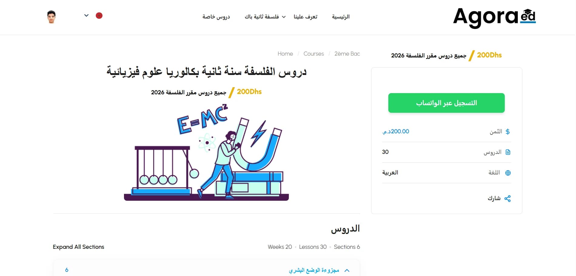
The interface knows who it's talking to
The two-audience conflict got solved with a platform that adapts in real time. Guests see a high-converting landing page: course value, clear pricing, immediate calls to action. Students see none of it — the moment access is granted, every promotional element, price tag, and enrollment button is replaced by a quiet, premium academic environment that is only about the curriculum.
One platform, two completely different experiences, and neither audience ever sees the other's interface.
Shaped like the syllabus
Bac syllabuses are heavy — and the design carries that weight without showing it:
Students scan the whole course in one glance, with progress visible as they move through it. The design stays minimalist throughout — in Arabic and French alike — and is sized for the phone screens most students actually study on.
The result
Agora-ed launched as a sleek, modern educational portal built around how its students actually buy and study. Enrollment feels like talking to a person, because it is one — and once you're in, the platform feels like a library, not a storefront.